One of the most important aspects of any MMO is its user interface, or UI. The story could be fantastic, the gameplay engaging, and the player base friendly, but if the interface through which you interact with that world is clunky or ill-designed, the game itself becomes a laborious chore. A lot of SWTOR’s UI will probably need to be played for its functionality to be seen; fortunately, SWTOR does seem to have solved one of the major problems of MMO UIs: information placement, and that we can talk about now.
Days of Yore
I’d like to take this examination further back than WoW, but to be honest, I wouldn’t know an unmodded EQ, EQ2, or UO user interface from Adam, having never played any of them. Instead I’ll start with the first MMO I sank a lot of time into: Final Fantasy XI.
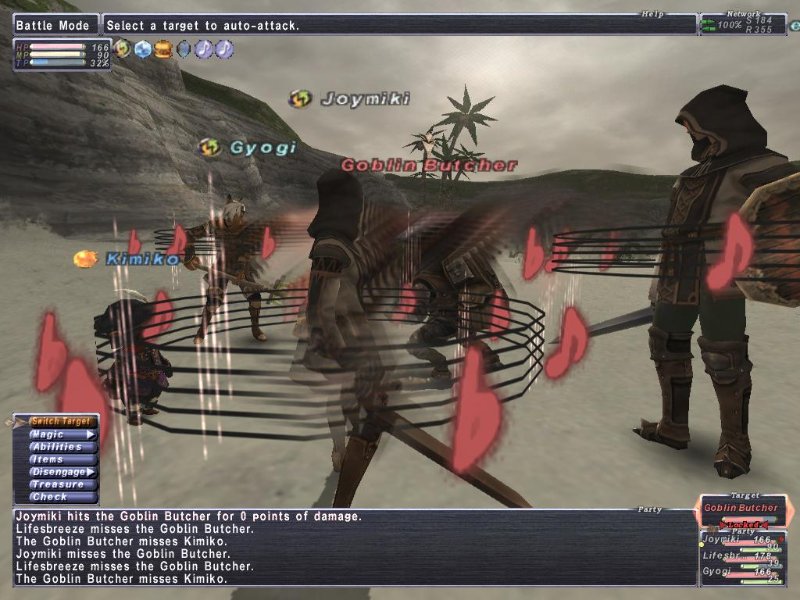 Picture from 1up’s “The Grind” column; click to embiggenThere are a lot of things we can say about FFXI’s UI, and none of them are very nice most of them can be summed up in one sentence: this was a console user interface developed by a primarily-console developer and shoehorned onto an online game.
Menu-driven. Combing through menus to find spells you needed to cast was your only option besides a palette of six-line macros.
Battle, chat, and everything else combined into one windows.
Lots of unclear little icons. I mean, I know why there’s a pic of a hamburger, two music notes, some swirly arrows, and two different kinds of muddy-colored crystals, but that’s six years of experience talkin.
Oh, and don’t expect to mouse over those icons and see what they mean, either. FFXI would rather pretend you don’t have a mouse - the primary audience, for all intents and purposes, is the Japanese PS2-playing FFXI audience.
But it’s also a prime example of terrible spacing of UI elements. One thing that’s consistent about MMOs is that your character, as your viewpoint into the world (so to speak), is the center of the screen - and the rest of the info is scattered to varying degrees around them.
It’s an established fact in design (and art, too) that the less the eye has to travel to reach a piece of information, the easier it is to comprehend and use. You might think of it as a basic design principle; it’s certainly been studied. So with that in mind, let’s look at that FFXI interface again.
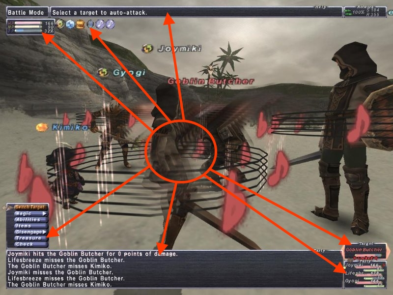 My arrows are boss. Click to embiggen.
It really almost seems like work was put into making your eye roam as far as possible.
Your party’s health and the enemy’s health are all the way to the lower right.
Your own HP, MP, and TP are as far away from that as possible, in the top left.
The buff/debuff bar is next to your own statistics, but as mentioned, actually viewing the info on them can be a task if you’re not using Windower plugins (which, as far as I know, still break the game’s Terms of Service).
The menu from which you select your actions if you’re not using macros is on the lower right…
…while the tooltip that actually shows that the menu item you’re on does is almost as far away as it can be - at the very top of the screen.
These are all pieces of info that are crucial to know at any given time, and even in FFXI’s sparse user interface, they are as poorly placed as they could possibly be.
It Gets Better… But How Much?
Now let’s move on to the interface that gets copied time and time and time again, the interface of World of Warcraft. Yes, I know, WoW’s addons allow an unlimited amount of customizability, but let’s assume for a second they didn’t - remember, there was an era before addons - and take a look at the UI a new user gets (mostly) confronted with.
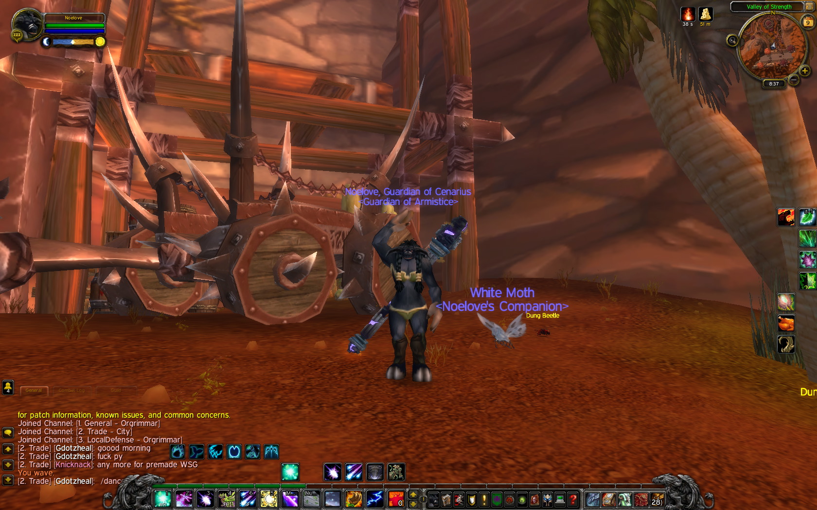 Pic courtesy of @noelove. Click to see full-size.WoW’s UI has some serious improvements over the previous example. (And how.)
(Some) movable elements. The chat log, in particular, can be fine-tuned to only show certain elements, and then moved around.
Hotbars. Buttons! ALL THE BUTTONS!
WoW acknowleges that you have a mouse, and sometimes you’d like to use it to do things. Just about anything you can interact with - be it button, boss, or buff - has a mouseover tooltip.
Certain amounts of in-UI data are moved in-world so as to be closer to the visual center - such as enemy health, which can be a bar over the enemy’s head, if you so desire.
For all that, though, WoW has a lot of stylistic fluff - and a lot of info people would prefer to see spelled out is left to vague visual cues - I mean, how red does the boss’ portrait have to be before I pull threat again? And some of its placement leaves… something to be desired.
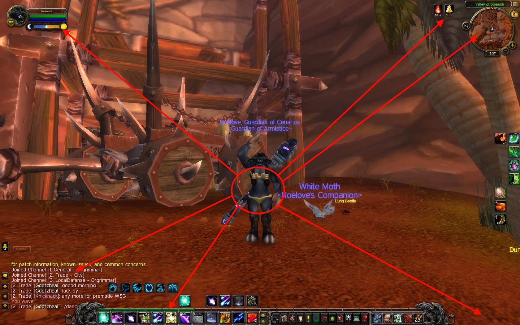 Click to embiggen.It’s not the best thing in the world, but WoW’s default UI is leaps and bounds ahead of FFXI’s. Let’s look at the ups and downs.
In its favor: the arrow pointing to the chat log? That could be anywhere. As mentioned, you can pull out your battle log - which would be considered more crucial on short notice - and move it closer to your character, or at least away from distracting chatter. Your chat can also be separated from battle and thus not get spammed away!
Also, all your buttons are in one place, and the distance you’d need your eye to go to get from mousing over a button to reading its effect is relatively low - from the button-pointing arrow to the arrow that seemingly points to nothing in the lower right.
However, once again, your own health/mana/runic power/rage/holy power/focus/energy/ALL THE RESOURCES are in the top-left. I almost wonder - why did this become the convenient default placement for all your info? It’s really quite far from your character as far as eye tracking is concerned, and is going to just get farther away as monitors grow.
The top-right is a mix of good and bad. Good: the minimap, highly non-crucial info, is out of the way up there where you only need to track your eye to it when you need it. But…
Bad: the buff/debuff bar, which often contains info you need to react to, is up there too. (Of course, Blizzard did help with this a little bit by blatantly copying the Power Auras addon and introducing UI elements that appear around your character to indicate things you need to react to, pronto - and adds a gold sparkly edge to the button that triggers whatever it’s glowing about. But these are non-configurable outside of “on” or “off,” and sometimes Blizzard implements them without a corresponding button to press - the initial indicator for an elemental shaman’s Lava Surge is a good example - and some of them are maddeningly inconsistent between classes.)
Slip-sliding around
Incidentally, WoW isn’t the only one guilty of that scattered mess. Does this look familiar?
 Pic courtesy of… me. Click to embiggen.Or rather, should I say…
 Still me. Click to embiggen. As usual.It’s almost a carbon copy of WoW’s UI placement, but there’s one important difference: - you can move literally every piece of that visible UI, scale it, and so on. (I haven’t bothered yet… but the more I write about UIs in this post, the more I think maybe I should work on that.) Being able to move elements around - if the UI by default isn’t the greatest - is a good compromise.
Another game set in a galaxy far, far away let you do just that…
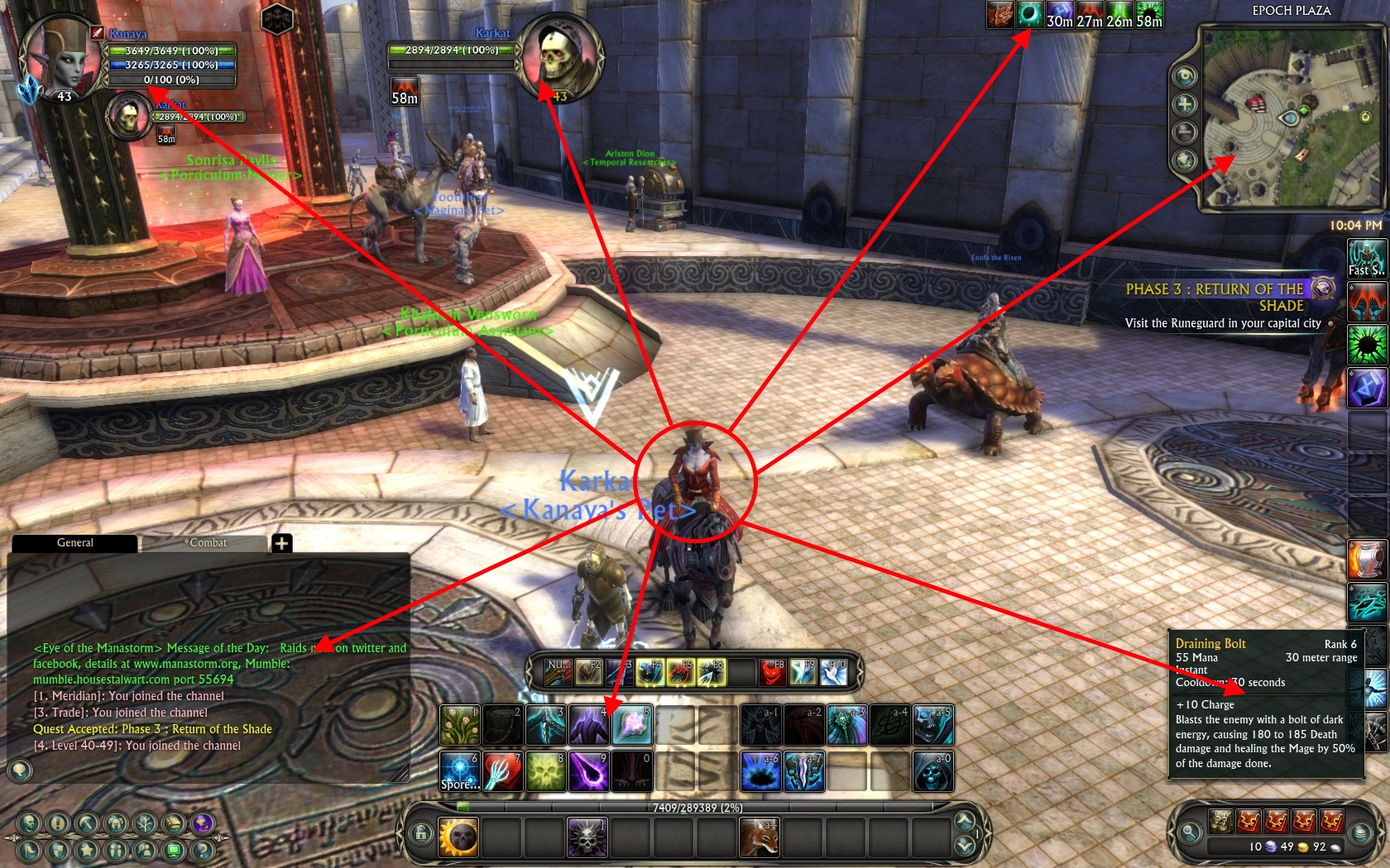
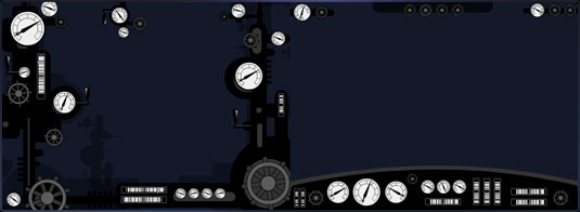
 Customized UI pic courtesy of @asros. Click to embiggen.Star Wars Galaxies permitted movement and (presumably) resizing of UI elements. Asros sent me this screenshot (and several others) of his UI, which displays a good principle of UI layout - clustering of essential vs. non-essential, and related, elements. Let’s arrow it up:
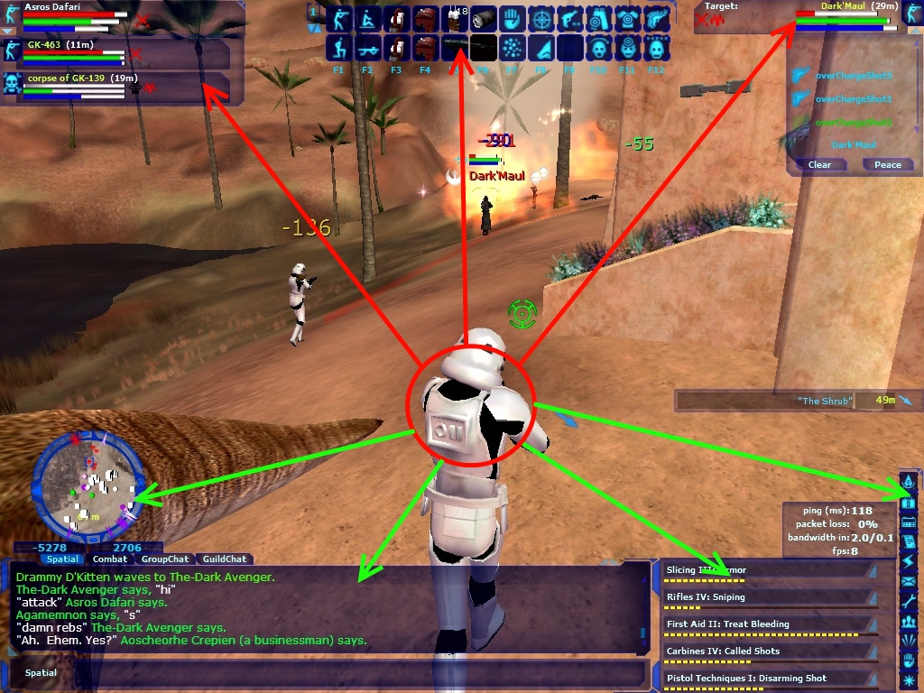 As usual, click to see full-size.In this case, the red arrows represent crucial information - related to combat, if I’m not mistaken - while the green arrows point to non-crucial information - chat, the minimap, et cetera. Elements of the UI that are related to each other are near each other, though there’s still a lot of eye-tracking involved - things that Bioware would take into account while creating TOR’s UI.
Trains vs. Sports Cars
First, go read this developer blog entry on designing the SWTOR UI. I’ll wait. A lot of the philosophy that went into the SWTOR UI (including the mess-of-jumbled-dials “train” vs. sleek-dashboard “sports car” analogy) and its current design is contained therein.
SWTOR’s UI development seems to have been guided by a couple important factors.
Minimalism. TOR does not waste a lot of space on unnecessary fluff like WoW’s gryphons, nor (now) does it have a ton of unnecessary, unused graphic black space. The UI takes up as little room as absolutely necessary (an important feature of several WoW addon packages, as well, like Lui).
Grouping. Michael Voigt actually points out in the developer blog post that they grouped UI elements by function, as well - combat systems in one place, party in another, and social elements in their own corner. The unspoken rule seems to be that the quicker you’d need to react to a UI element, the closer it is to the player model/center of the screen.
“Star Wars”-y. While a tertiary concern at best, TOR’s UI still - despite its minimalism - maintains a feel of being something that belongs in a Star Wars game.
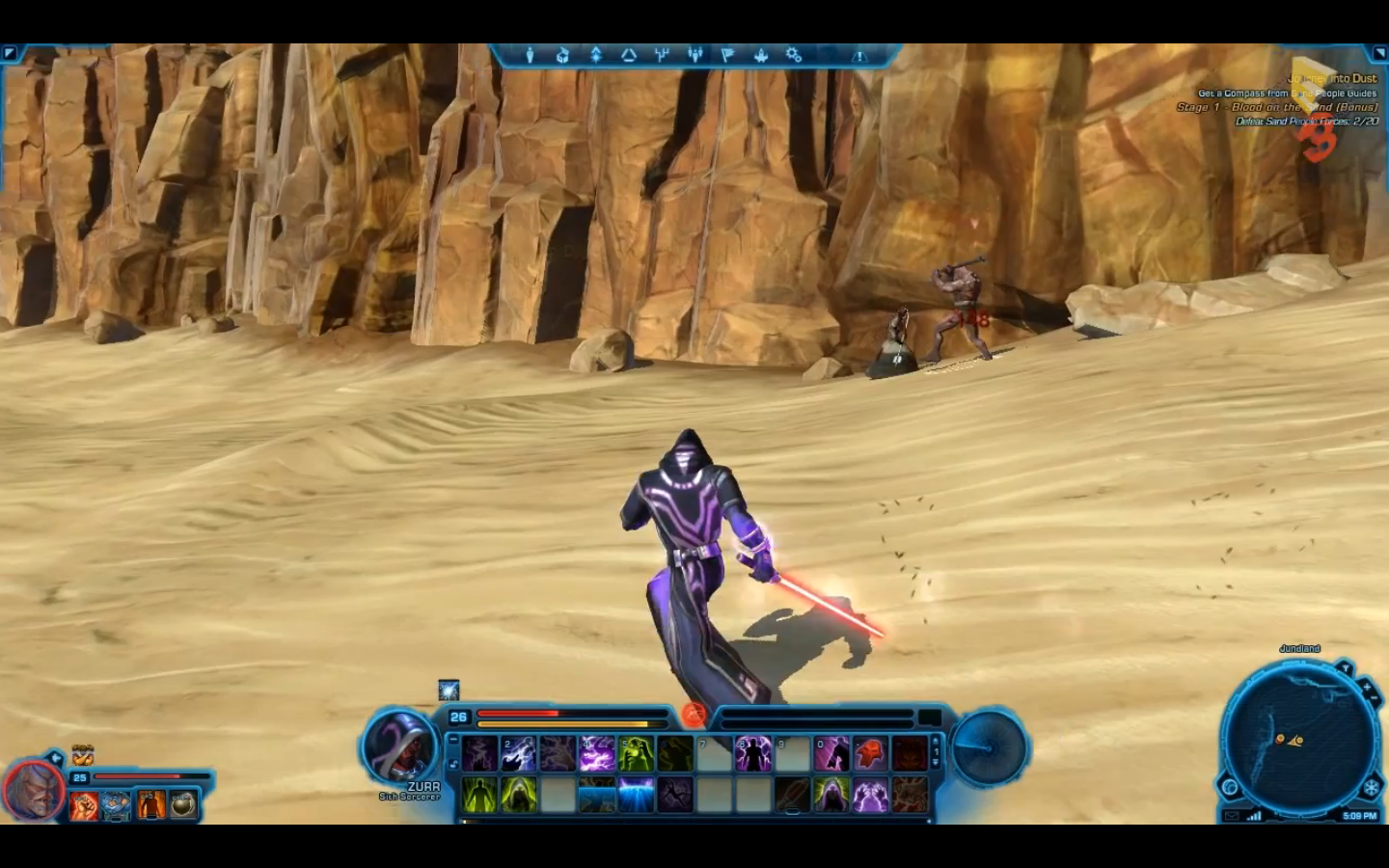
Let’s take a look at a screenshot from the Tatooine walkthrough from E3.
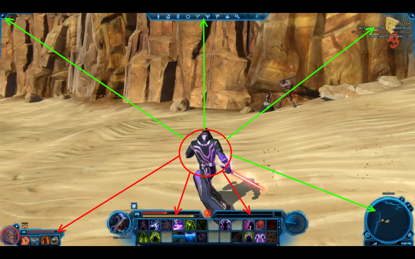
 Taken directly from the Tatooine walkthrough. Click to embiggen.Here we can see clearly pick out the grouping elements that Voigt talked about, as well as examples of the importance-to-distance ratio. Shall we? Yes, let’s.
 You know what to do to see a full-sized picture by this point in the article.
Our important, must-be-seen-quickly elements are close to the center - or at least close to each other. Combat - basically all combat info - is front-and-center at the bottom of the screen. Even buffs and debuffs are condensed down here - notice the buff above Zurr’s level at the bottom.
Your opponent’s combat info remains right next to yours - but whereas in most MMOs this would be at the top-center of the screen, here it’s a short distance from the player’s own combat info. Handy!
Companion info, while not immediately at hand, is right next to your own combat info. If Zurr was in a party, that would be immediately above the companion.
The low-importance info is rendered even farther away - the minimap (and popup tooltip immediately above it) are at the bottom right (a seemingly unusual placement for MMOs - then again, most MMOs don’t seem to have any idea what to do with this particular space), while the quest tracker, social info, and menu bars are all along the top of the screen.
Is this revolutionary? Not necessarily. Is it different from normal MMO UIs? Enough to take notice of, yes. Bioware seems to have given special attention to clustering of related info, placement of UI elements to (for the most part) reduce eye tracking, and has done a decent job of making important elements bigger and less-important elements smaller. Time will tell if this was wise planning, but right now?
It looks damn good to me.